Brand Identity Design for a
Conceptual Travel Agency
CASE STUDY
THE CHALLENGE
Aiming to combine illustration and brand design, I started a series of personal projects. The first result is “Joie Française”, a conceptual travel agency that delivers top-notch experiences on the French Riviera.
THE OUTCOME
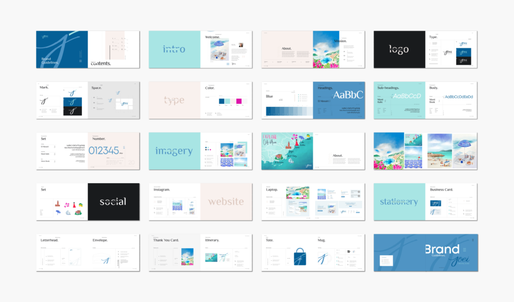
For this captivating project, I crafted the brand’s identity, significantly emphasizing illustration, complemented by hand-drawn elements’ unique charm.
THE SCOPE
- Brand Identity Design
- Illustration
- Web Design
- Collaterals Design
Before starting…
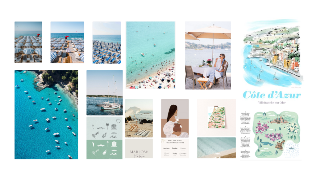
Knowing my goal was to interweave brand identity design with illustration, the inspiration for a travel agency focusing on the French Riviera sprung from my personal quest to discover my next dream getaway.
The vibrant colors and the effortless fusion of relaxation and luxury innate in the Riviera lifestyle felt like the perfect blend for this project.
Being the guide to the unforgettable charm and style of the French Riviera, I wanted to portray this through vivid and effortless painterly scenes. This invites the audience for the trip of their lives and opens a door for them to be more curious about what’s about to come when they arrive.
Defining the Brand
The first step was determining the brand’s name. I was intrigued by the idea of connecting it to France, perhaps using a French word or phrase. After several brainstorming sessions, I decided on the name Joie Française, which translates to ‘French Joy’ – an embodiment of the experience I aim to offer customers.
Joei Française WAS BORN
Joie Française is your luxury passport to the resplendent French Riviera, a bespoke travel agency that curates experiences dripping in elegance, culture, and authentic French flair. Our agency specializes in crafting personalized vacations in the sun-dappled playground of the world’s elite, guiding discerning clients through the myriad marvels that only the Côte d’Azur can offer.
Next, I proceeded with defining the brand. This required conducting a mini-strategy session to uncover the brand’s mission, vision, values, and personality.
brand PERSONALITY + VALUES
Joie Française is personified as an effortless sophisticated, cultured, and passionate individual who embodies the allure and charm of the French Riviera lifestyle.

Designing the Brand
THE LOGO
Subsequently, I moved on to sketching the logo. Knowing that I wanted to incorporate illustrations and hand-painted elements into the branding, I was certain that a hand-scripted logo would be the perfect fit. It’s a blend of calligraphy, used for the word ‘Joie’, and the elegant typeface El Messiri applied to the word ‘Française’.
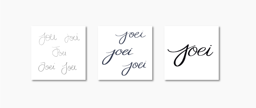
The identity is designed to convey a sense of personalization and authenticity that reflects the brand’s personality:
THE COLOR PALETTE
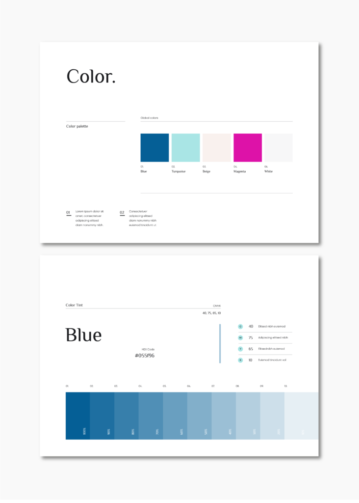
Selecting the color palette was very straightforward. Inspired by the hues of the sea and bougainvilleas found along the French Riviera, the selected colors aim to transport the audience to its vivid and mesmerizing views.
THE TYPOGRAPHY
I retained El Messiri for the headings for the typography set, as it pairs perfectly with the Mont typeface, which I used for subheadings and body text.

THE GRAPHICS AND ILLUSTRATIONS
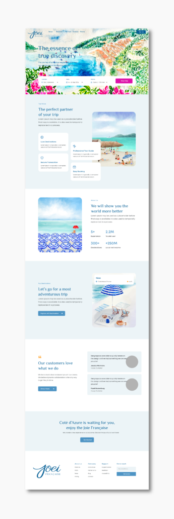
The next step, though the most exciting, was also the most time-consuming: creating the illustrations. For this, I employed a blend of real watercolors and digital painting to capture landscapes and beach scenes that articulate the brand’s authenticity and personal touch. These illustrations are incorporated into the brand’s website and collateral materials, such as thank-you cards and itineraries featuring an illustrated map.

The Collaterals
Once the illustrations were completed, I moved on to designing several collateral pieces that showcased them. This included a tote bag serving as a welcome pack, containing items such as a thank you card, candles, a notebook, and the itinerary.
My personal favorite is the illustrated map, which highlights various locations the customer will visit within the Côte d’Azur, serving as a visually engaging itinerary.
The Website
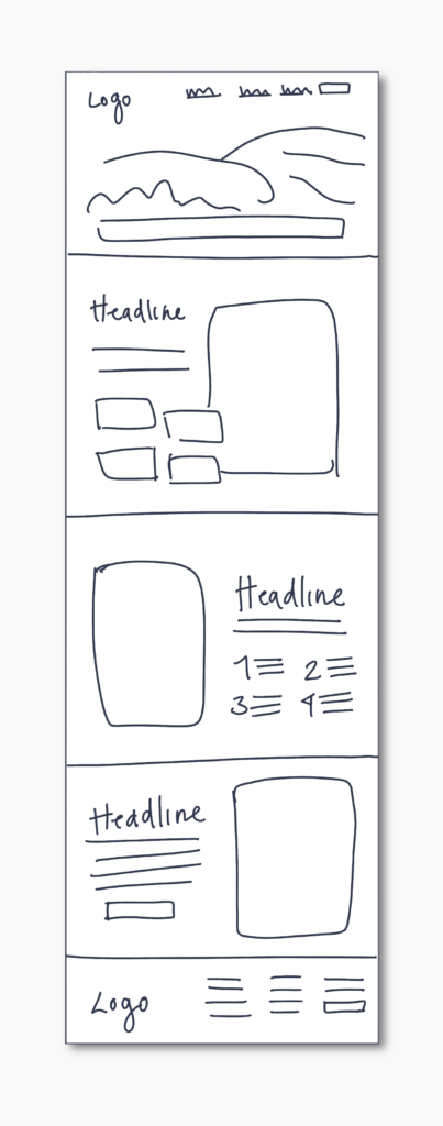
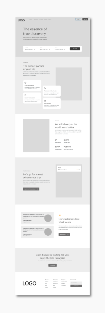
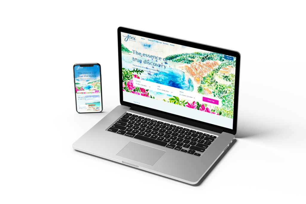
Ultimately, I brought all the elements together to shape the website’s interface, seamlessly intertwining a contemporary aesthetic with the hand-drawn illustrations, infusing an authentic charm throughout the design.
