UI and UX Design for CELLRETURN
CASE STUDY
THE CHALLENGE
Redesigning an outdated website for a high-end beauty-tech brand, by placing a strong emphasis on the customer journey, ensuring information is easy to digest, and allowing the user to purchase within two clicks.
THE OUTCOME
I led this project during my work as Creative Director at ONE11 Creative Agency. I began by establishing the website’s art direction and creating its sitemap and information architecture.
Followed by directing the wireframing, UI and UX design, as well as collaborating with the actual design.
THE SCOPE
- Creative Direction
- UI and UX Design
- Site mapping
- Wireframing
- Prototyping
Introducing CELLRETURN…
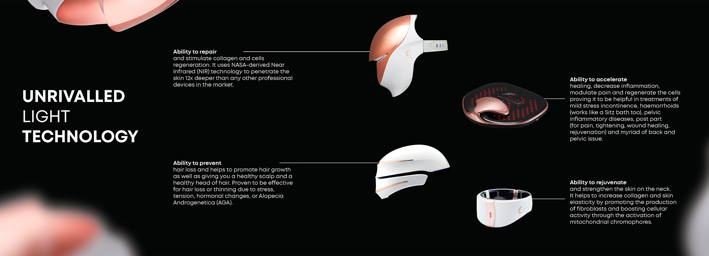
CELLRETURN is a prestigious Korean beauty-tech brand that harnesses NASA’s LED technology in its devices, allowing users to heal, rejuvenate, and repair cells across their face, scalp, body, and neck.
The brand offers a suite of four distinct devices, each addressing specific health and beauty concerns. A prime example is the CELLRETURN Platinum Face Mask, designed to regenerate cells, stimulate collagen production, and rejuvenate both the face and neck. Users can expect transformative outcomes such as diminished fine lines, healing of acne and rosacea, and a more even and radiant skin tone and complexion.
While CELLRETURN has established a presence in Korea and the UK, and it’s now ready to enter the GCC market. This expansion needs a fresh website that encapsulates the brand’s premium essence and explains its products’ intricacies.
The Client’s Objectives
Entering the UAE market, renowned for its high beauty care and fashion standards, presented our foremost challenge. Our secondary challenge lay in ensuring potential customers comprehended the nuances of the products, grasped the technology behind them, and recognized the value proposition.
With that in mind, the client’s objectives were clear and straight:
- Craft a luxurious UI and UX design.
- Distill intricate product and technology details into easily digestible segments.
- Enable purchases within two clicks.
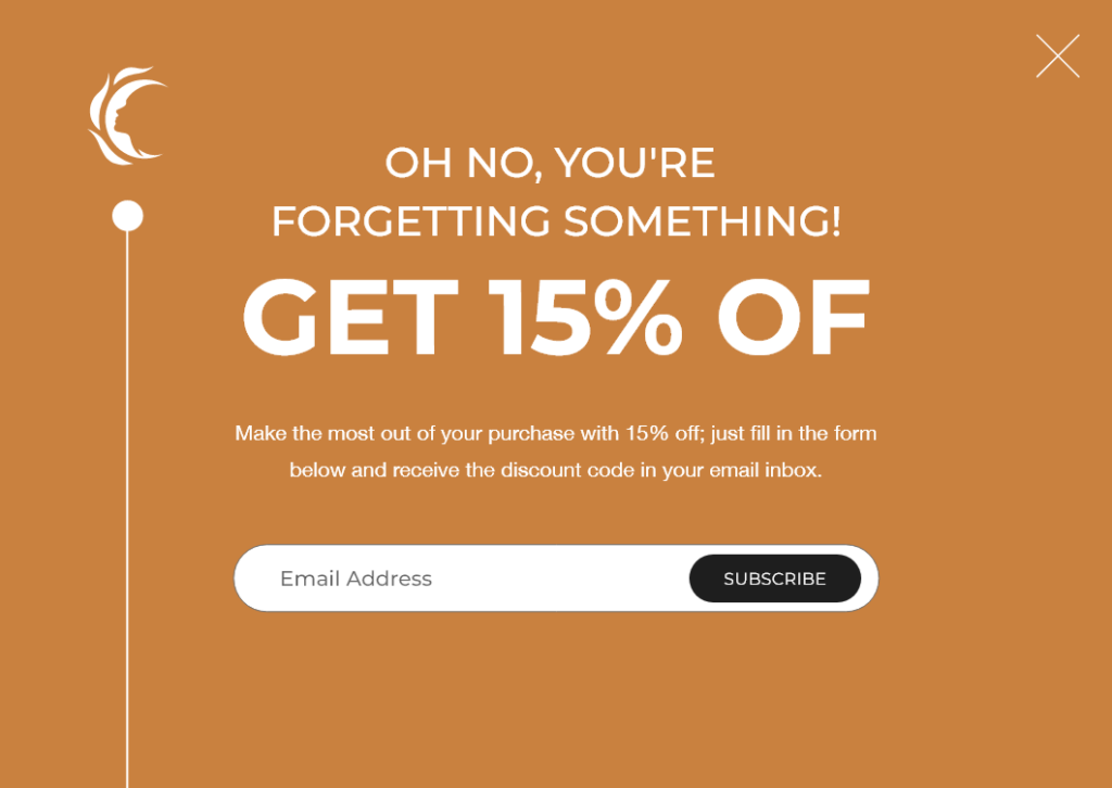
- Capture user information, even if a purchase isn’t made on the initial visit.
Designing the Website
THE CREATIVE + ART DIRECTION
After an in-depth briefing session with the client, wherein I gained a comprehensive understanding of the brand, I embarked on the initial step: defining the website’s creative direction.
This led me to the following concept:
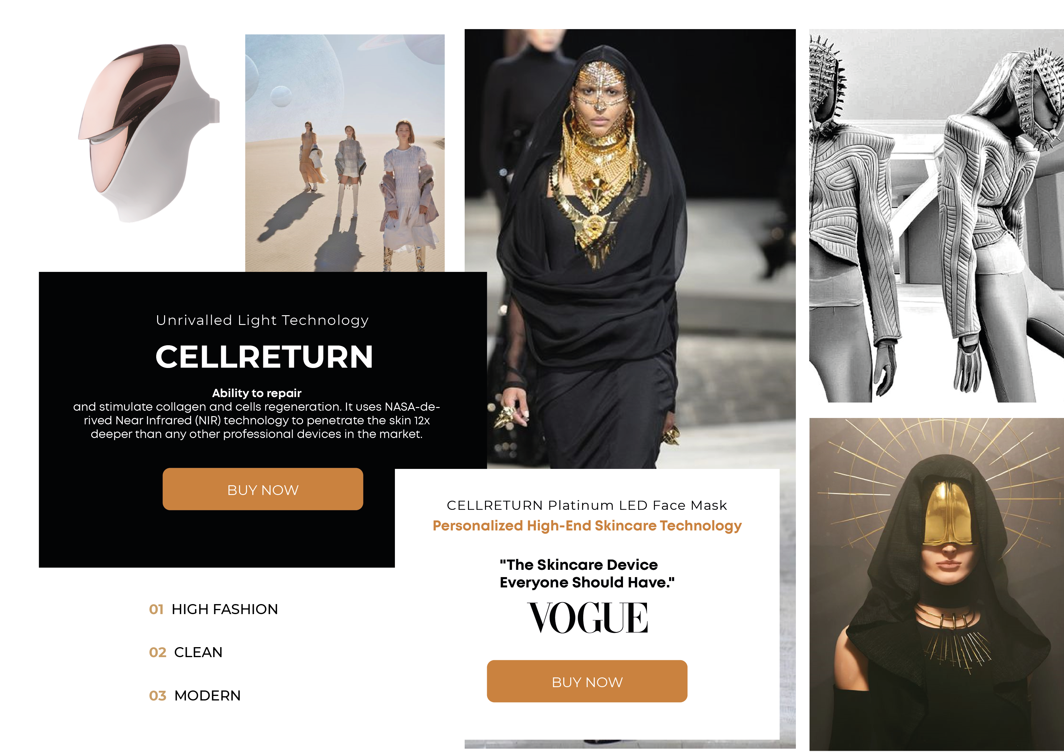
WHERE BEAUTY AND FASHION MEET TECH
Then, I continue with determining the art direction, aiming to have a balance between all three main elements of the concept. Below you can see the style tile including photography style, typography arrangement, colors, and button style.
THE PHOTOSHOOT + ILLUSTRATIONS
In order to have a cohesive look throughout the website that conveys the concept effectively, we conducted a photoshoot. You can see some of the pictures below:

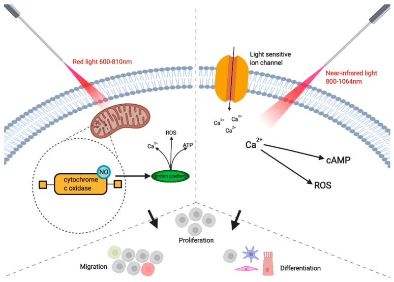
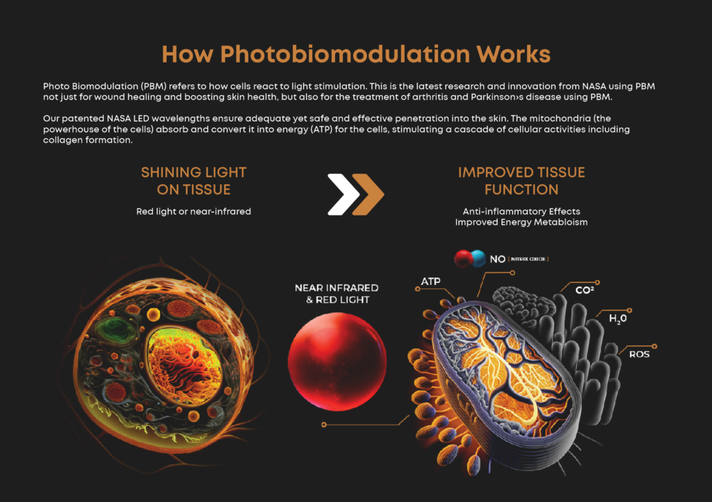
Updating the pictures explaining scientific concepts was one of the most fun challenges. With the use of AI we created the main elements such as the cells and mitochondria, then we edited, and added the rest of the details and information in Photoshop.
Before
After
THE SITE MAP + INFORMATION ARCHITECTURE
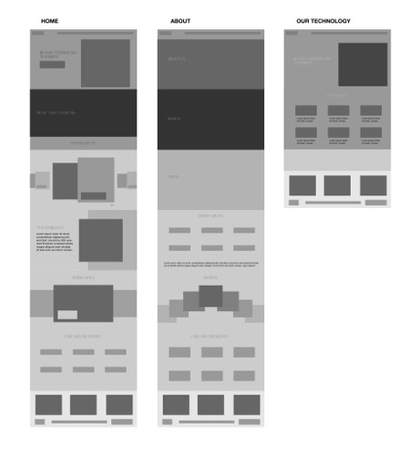
After studying the copy and documents provided by the client, I proceeded to create the site map and information architecture of the new website. Ensuring a seamless use experience.

THE WIREFRAME
I aimed for a dynamic layout with clear sections throughout the pages.
THE WEBSITE
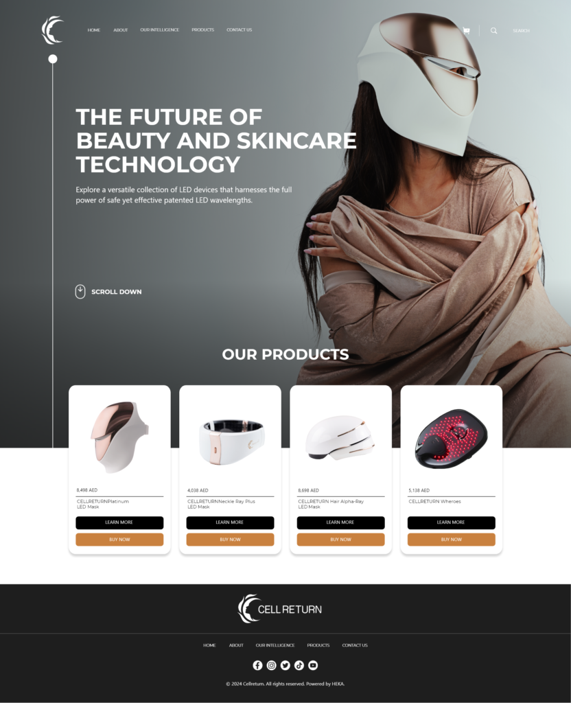
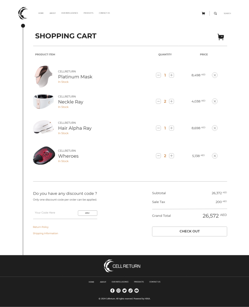
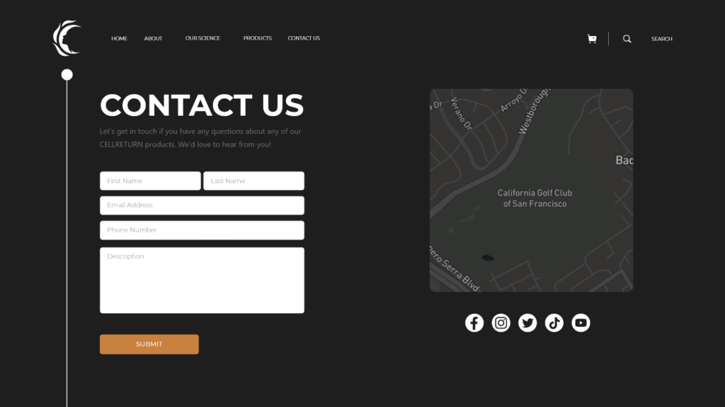
For both the design and the prototype, we worked on Adobe XD. Making it easy for the designer involved and myself to collaborate together, and for the client to add comments for changes. You can see a glimpse of how the final website looks like down below, which has a perfect blend between high fashion, beauty, and tech.
HOME PAGE

SIGN UP FORM – BEFORE CLOSING
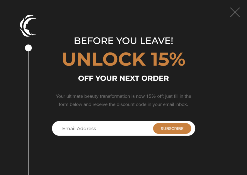
SIGN UP FORM – WITHIN FIRST 10 MINUTES

SIGN UP FORM – ITEM ADDED TO CART WITHOUT CHECKING OUT
PRODUCT PAGE

SHOP PAGE
CART PAGE
CONTACT PAGE
THE PROTOTYPE
SUPPORTING FILES
Along with the prototype and XD developers link, we provided the open files in Adobe XD, including prototypes for the sliders and source code that the developers can make use of.
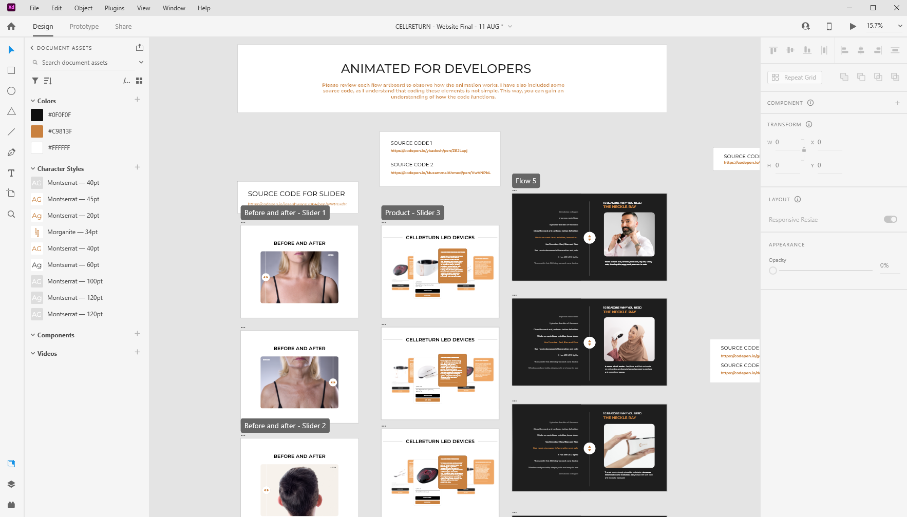
Product Slider
(Drag the product cards)
Benefits Slider
(Click the arrows)
Before and After Slider
(Draw the arrows)