Brand Identity Design for a
Mexican Restaurant
CASE STUDY
THE CHALLENGE
Crafting a brand identity for an upscale Mexican restaurant, inspired by the iconic allure of Tulum. My goal was to fuse Mexico’s vibrant culture with a touch of luxury.
THE OUTCOME
A brand identity and assets influenced by the vivid hues of Mexican cenotes and jungles, interwoven with the region’s distinctive patterns that seamlessly blend its essence and artistry.
THE SCOPE
- Art and Creative Direction
- Naming
- Brand Strategy
- Brand Identity Design
- Illustration
- Pattern Design
- Collaterals Design
Welcome to Ki’il Tulum
As a passionate food lover and proud Mexican, working on this project has been one of the most fun experiments. During my last visit to the Mayan Riviera, I got to experience this region’s rich culture and flavors on a whole different level, from plunging into the cold cenote’s water to motorbiking through the jungle at sunset, from savoring authentic Yucatecan cuisine to engaging with the descendants of the Mayans, – it was truly as if I was a foreign tourist in my own country.
With a desire to showcase this enchanting corner of Mexico to the world, I envisioned a culinary venture. One that would not only entice taste buds with genuine dishes but also resonate with the soulful charm of Tulum’s culture.
Ki’il Tulum was born.
With savory and sweet delights, such as Ceviche, Mole Negro, Cochinita Pibil, and Churros, and captivated by the Mayan language, I chose the word ‘Ki’il‘— meaning ‘delicious‘ or ‘tasteful‘ — and combined it with ‘Tulum‘, spotlighting the origin of these gastronomic wonders.
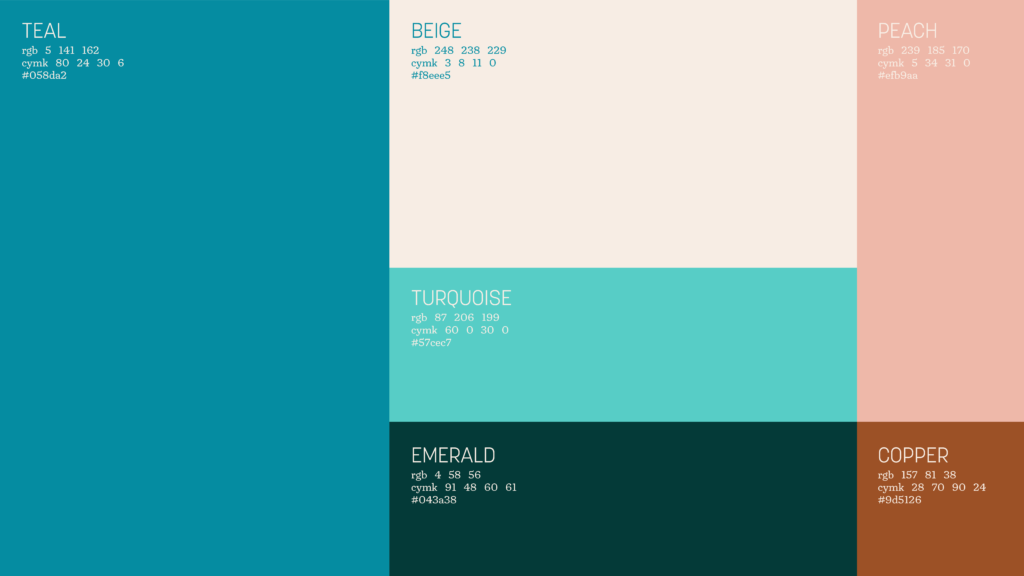
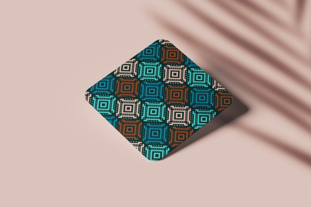
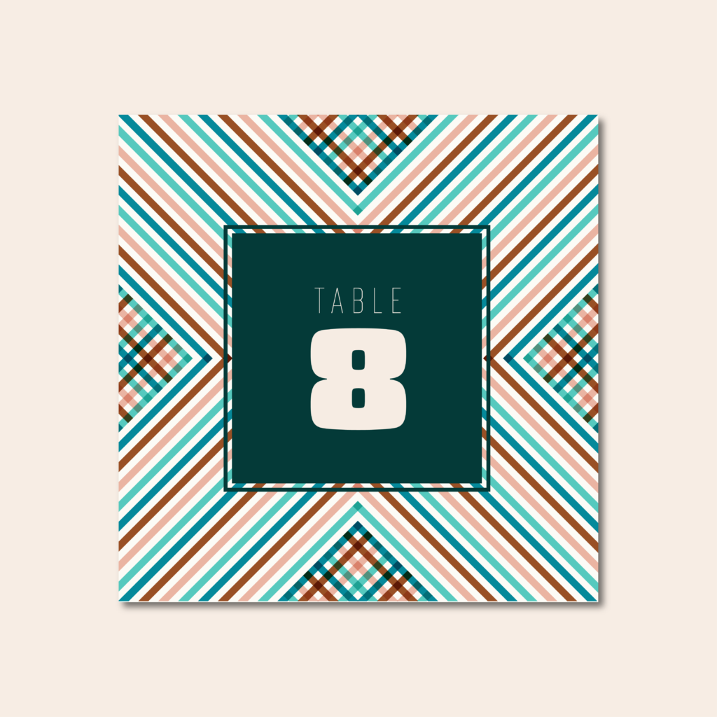
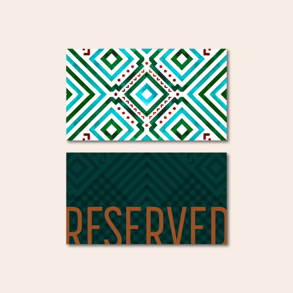
The brand’s hues draw inspiration from the vibrant tapestry of Tulum’s cenotes, lush jungles, and the Yucatan’s blush-toned beaches.
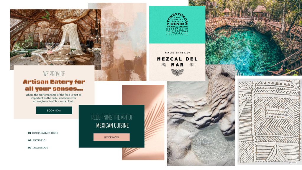
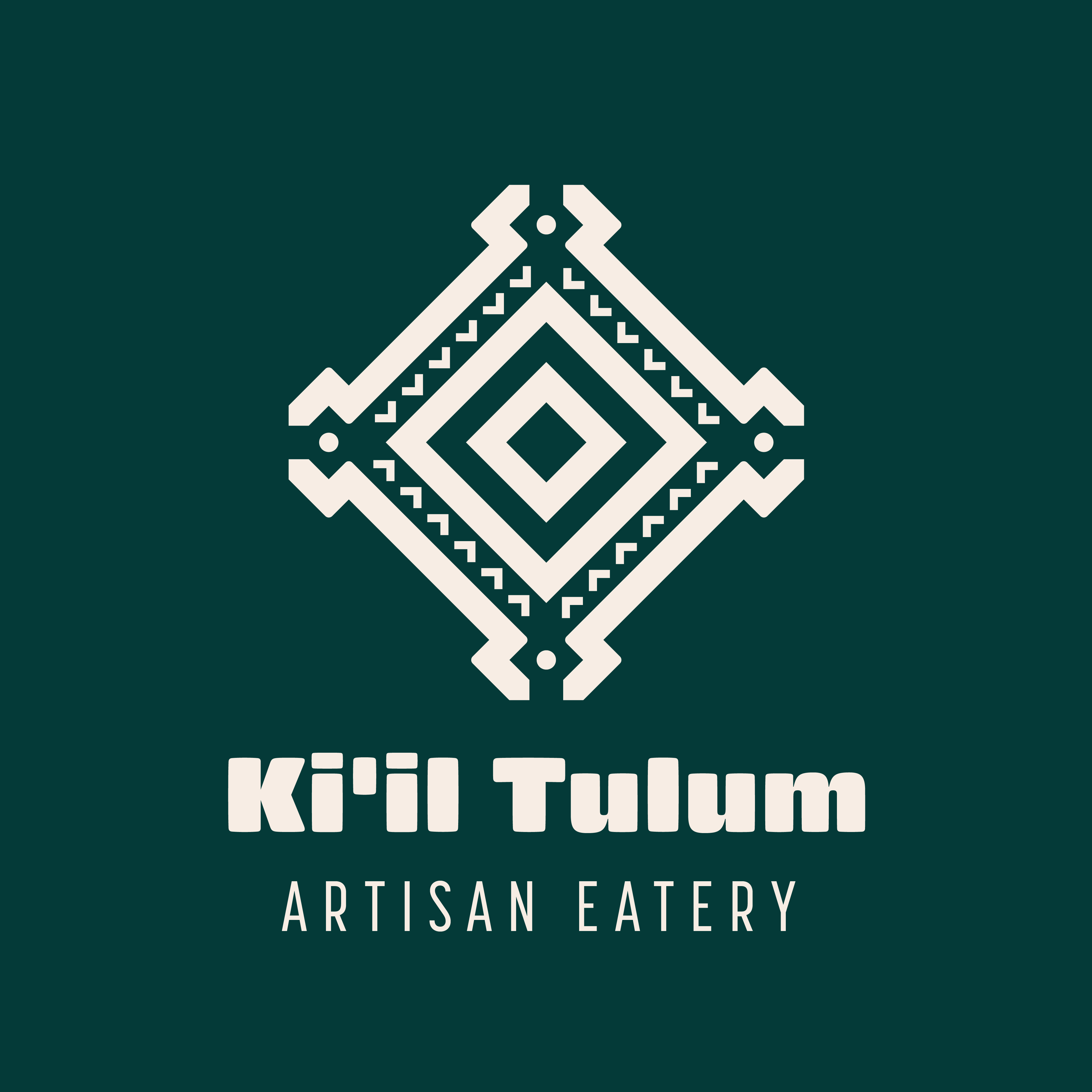
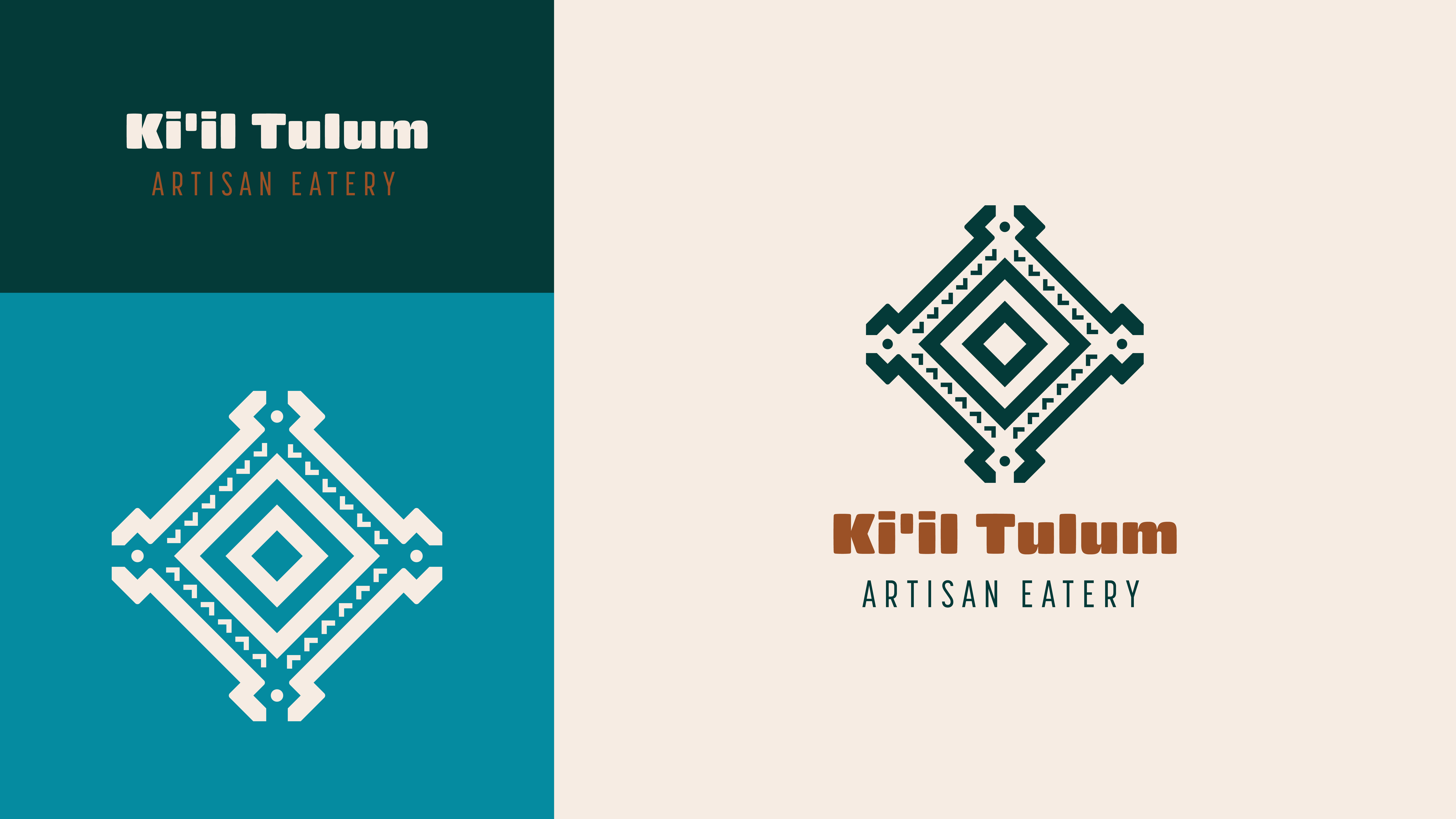
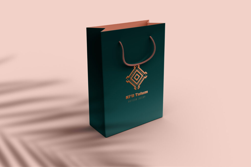
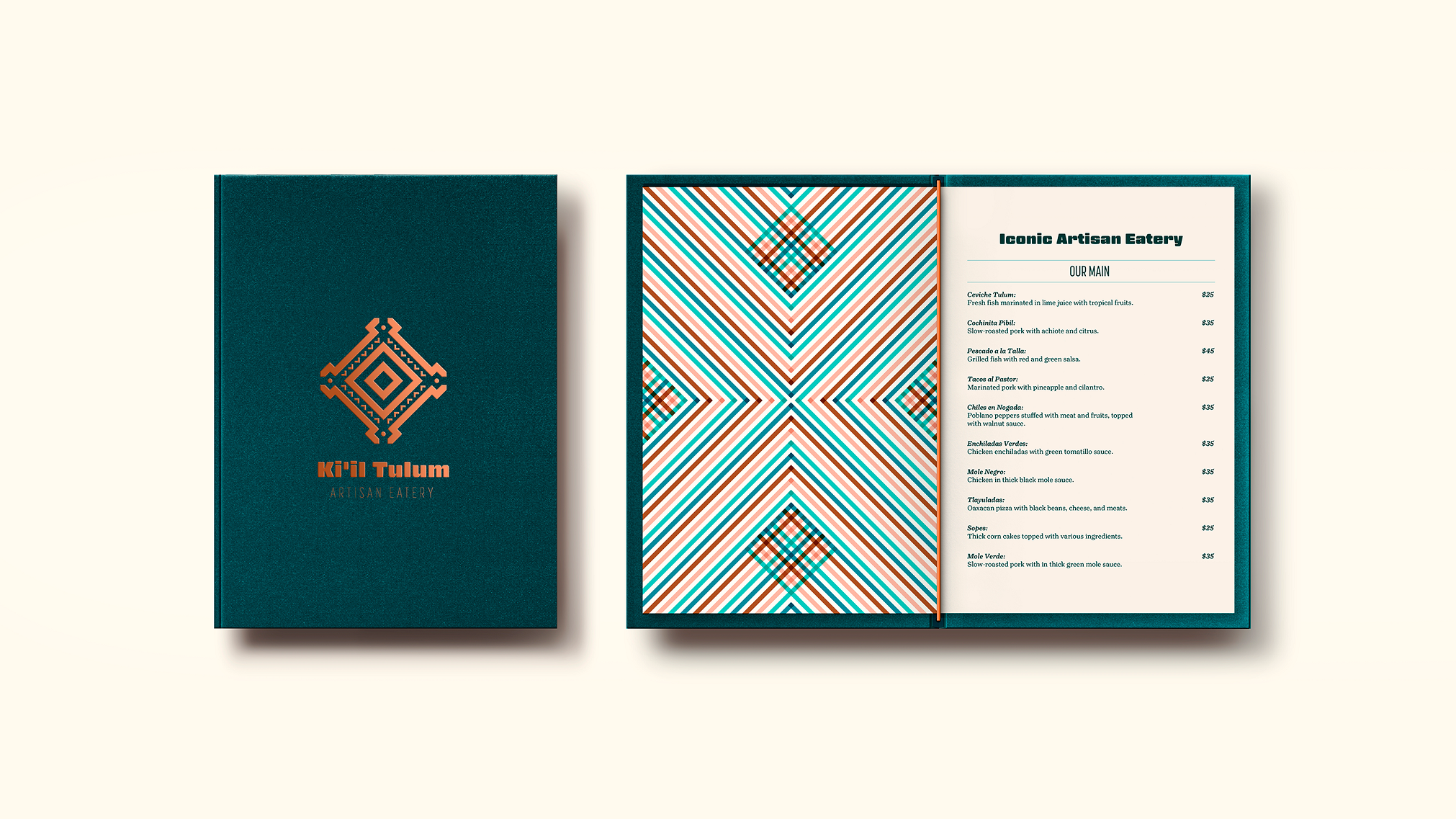
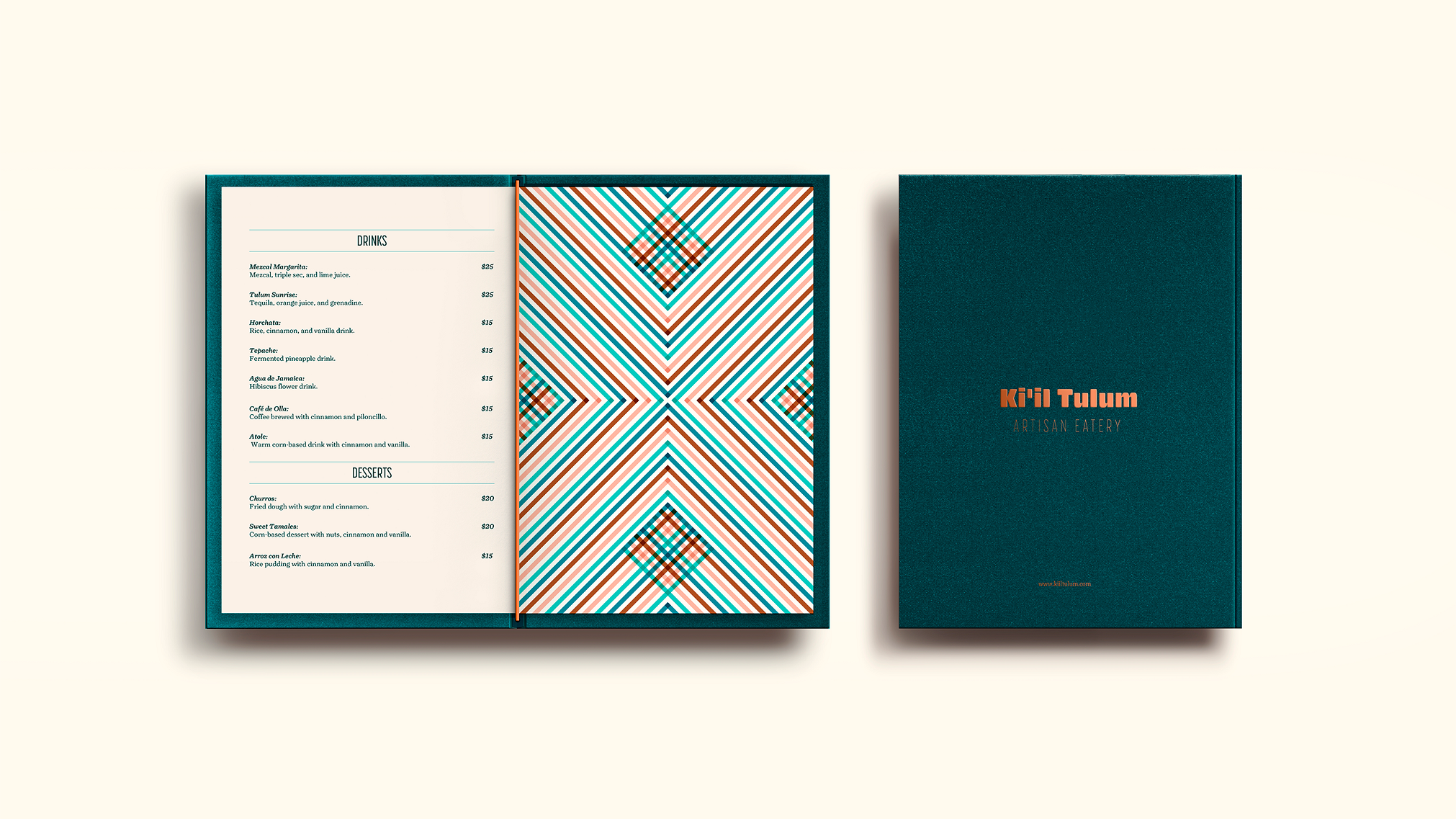
The patterns and emblematic logo are tributes to artisanal craftsmanship, while the robust, rounded typography reminds us of abstract Mayan glyphs.
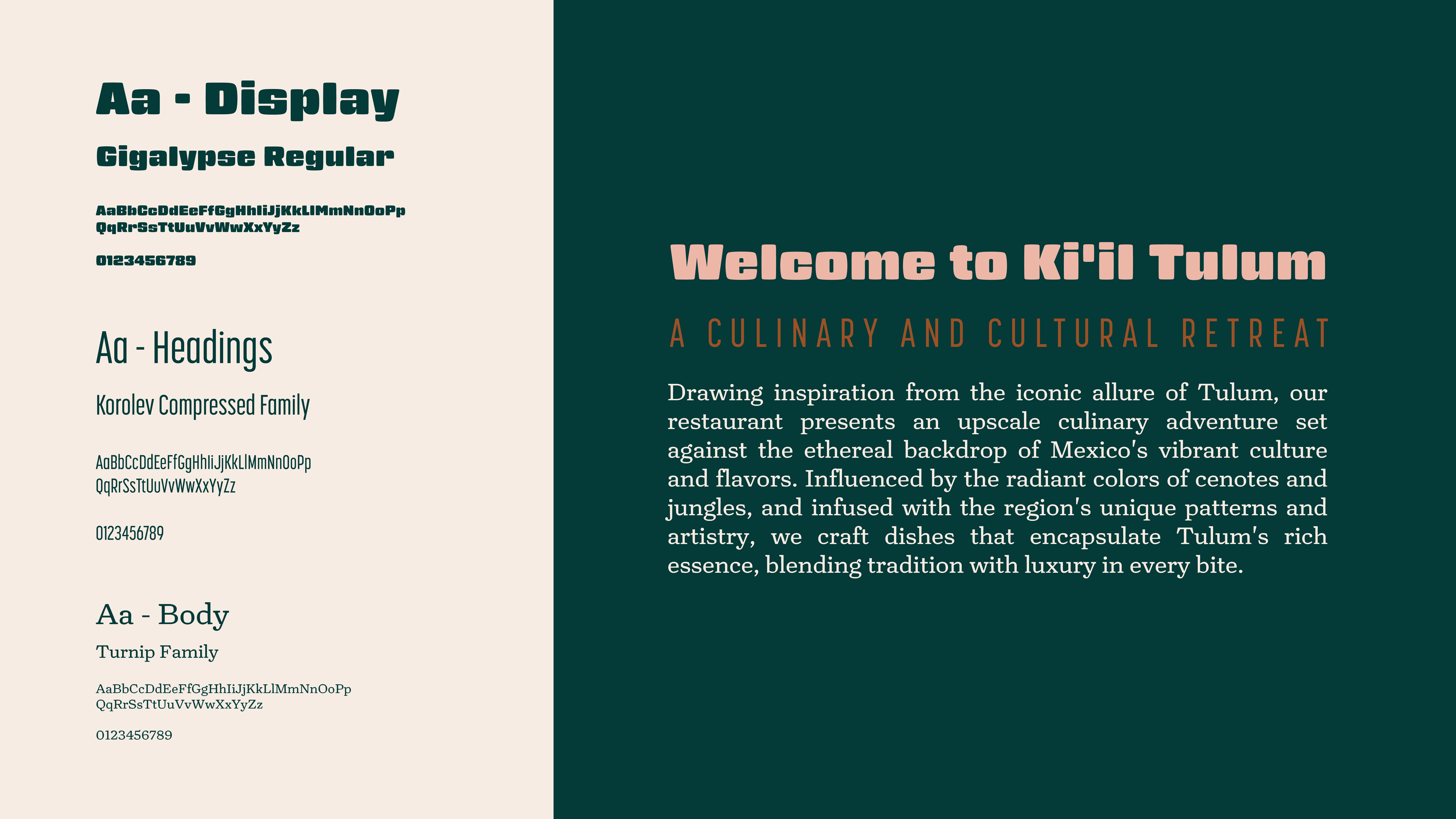
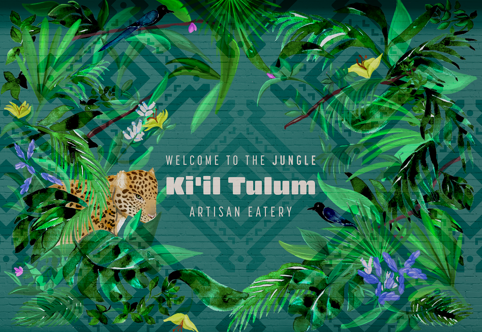
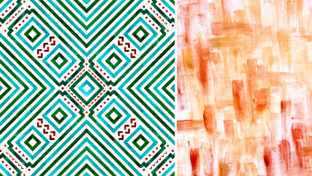
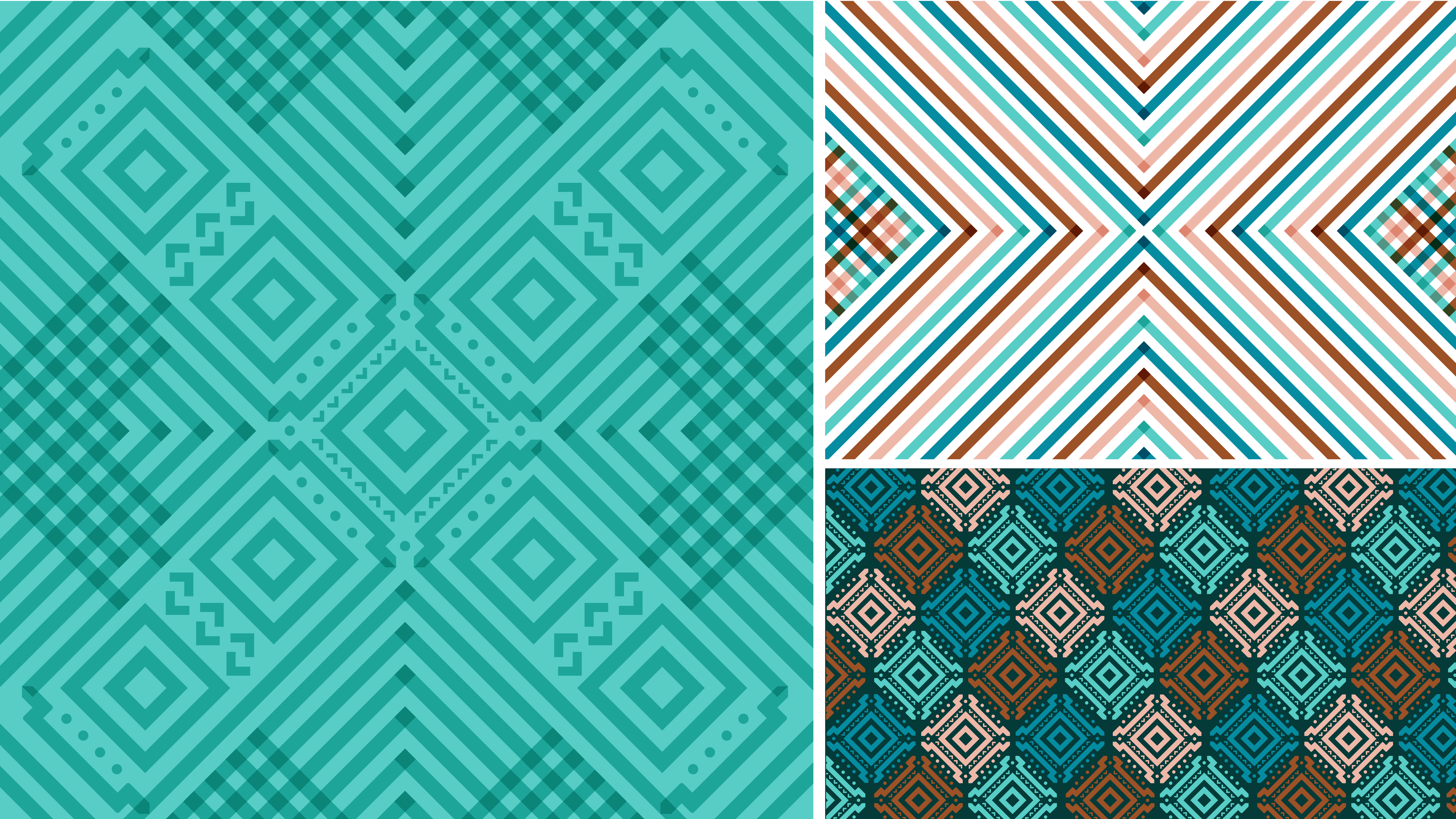
I hand-painted the main pattern and textures using watercolors and created the secondary patterns as vectors.
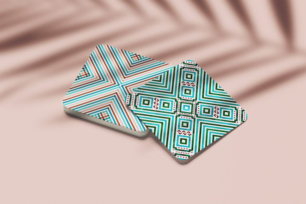
I mixed the brand’s patterns with a touch of luxury accents, such as copper foil, for the collaterals.
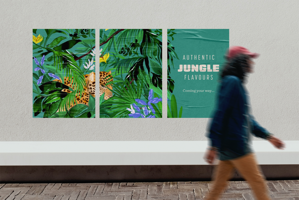
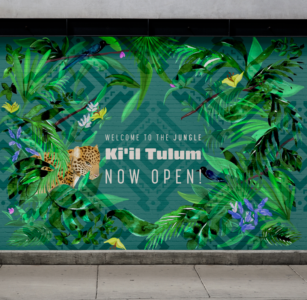
And, for the opening campaign, I created hand-painted illustrations depicting the Mexican jungle’s flora and fauna.
